Redesigning Spectroscopy Software for the Modern Lab
A Modular Desktop Application for Advanced Spectral Analysis for Avantes
Avantes, a global leader in fiber-optic spectroscopy with over 30 years of expertise, needed to modernize the user experience and brand identity of their flagship desktop application. Mono conducted on-site user research in the Netherlands — working directly with Avantes and academic institutions — to redesign AvaSoft X from the ground up. Through interviews, UX audits, and iterative testing, we overhauled the entire interaction design of this native desktop application across nine specialized measurement modules and created the new AvaSoft X brand, delivering a modern, accessible interface with a distinct identity built for precision and extended use.
Industry
Scientific instruments & spectroscopy
Company overview
Avantes is a leading innovator in fiber-optic spectroscopy instruments, headquartered in Apeldoorn, the Netherlands. They develop and manufacture spectrometers, light sources, and analytical software serving industries from agriculture and biomedical to semiconductor and solar energy. Their technology even reaches beyond Earth — Avantes instruments are used in astronomical spectroscopy research, helping scientists analyze the light of distant stars and celestial objects.
Our Approach
Mono's team traveled on-site to the Netherlands to conduct user research with Avantes' engineers and researchers at academic institutions who rely on spectroscopy daily. Through structured interviews and contextual inquiry, we mapped existing workflows and pain points. We developed the new AvaSoftX brand identity and redesigned the complete UX across all nine modules — from Spectrum analysis and Color measurement to Raman spectroscopy and LIBS — establishing a unified dark-themed design system and shared component library in Figma. Throughout the process, we worked alongside Avantes' development team to ensure efficient handoff and supported them with user testing during implementation.
Tools & Process
Research
Client workshops, target audience analysis, user interviews, and user personas to understand the needs of researchers and lab technicians working with spectroscopy daily.
Flows
User flows and application maps created collaboratively using Google Workspace and Figma.
Wireframes
Low-fidelity wireframes built in Figma to explore information architecture, navigation models, and module selection patterns before committing to visual design.
Hi-fidelity mockups & prototypes
Detailed screen designs and interactive prototypes in Figma covering all nine modules, the design system, and brand identity.
On-site testing
User testing sessions conducted on-site in the Netherlands with researchers and lab technicians to validate design decisions and refine the experience.
The Challenge
Avantes' existing software had served the scientific community well for years, but its interface had not kept pace with modern usability standards or the growing complexity of spectroscopy workflows. Our UX research revealed several key challenges that needed to be addressed:
Outdated user experience
The existing interface relied on legacy UI conventions that created a steep learning curve for new users, while power users had developed workarounds rather than efficient workflows.
Complex data presentation
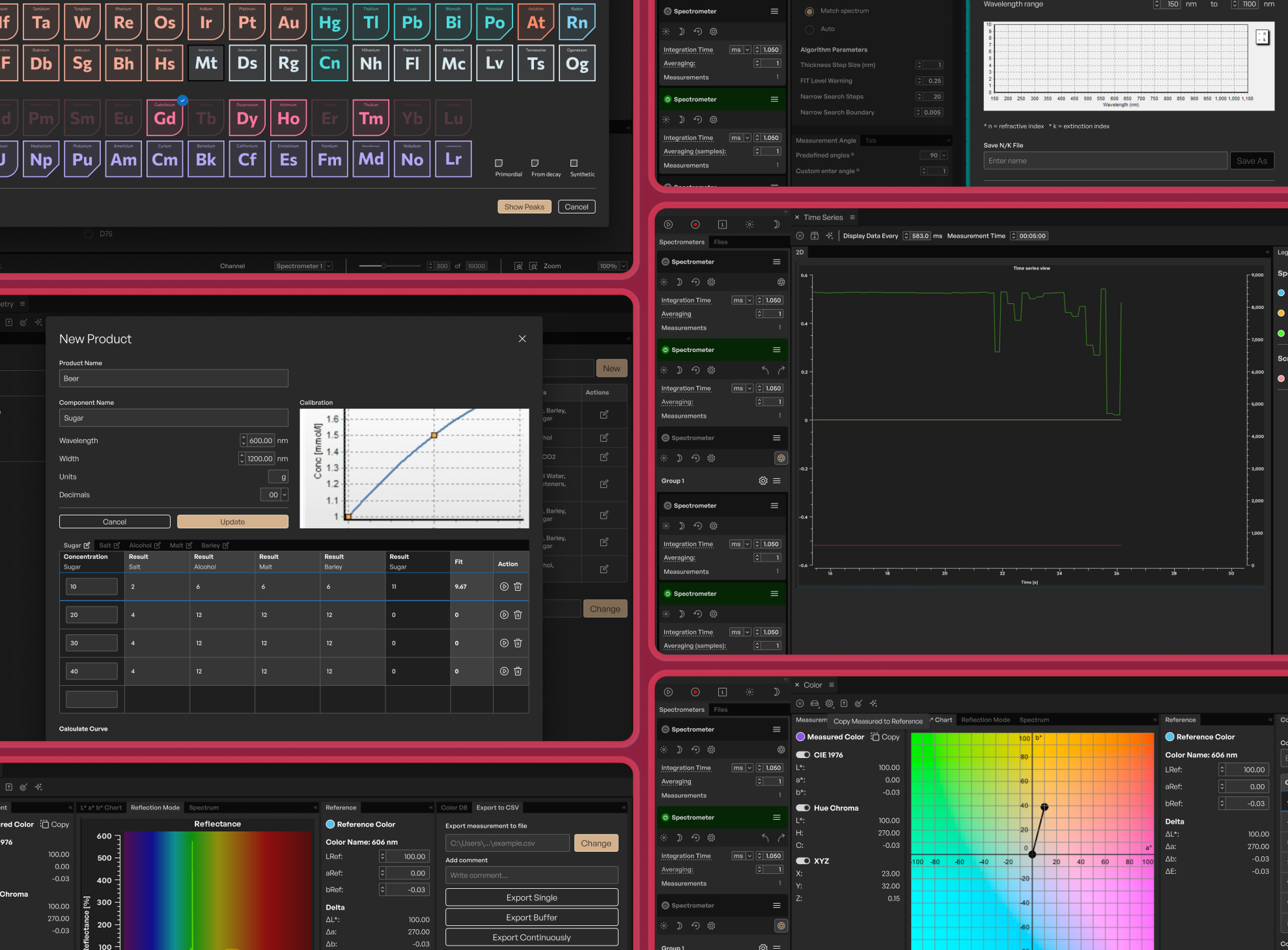
Spectroscopy generates dense, multi-dimensional data. Designing clear and intuitive visualizations — from 2D spectral graphs and CIE chromaticity diagrams to 3D surface plots — required deep understanding of how researchers actually read and interpret this data.
No unified design language
Nine distinct measurement modules had evolved independently over time, each with its own navigation patterns and visual conventions, making the platform feel fragmented and inconsistent.
Brand identity gap
The software lacked a cohesive brand identity that reflected Avantes' position as a premium scientific instrument manufacturer, creating a disconnect between the quality of the hardware and the perception of the software.
Before & After
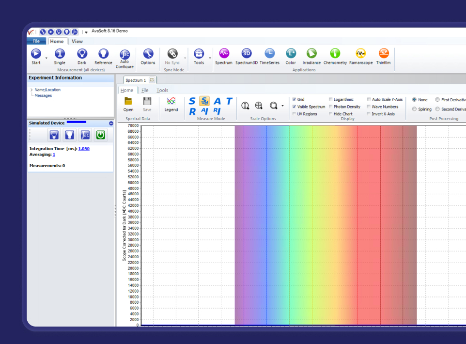
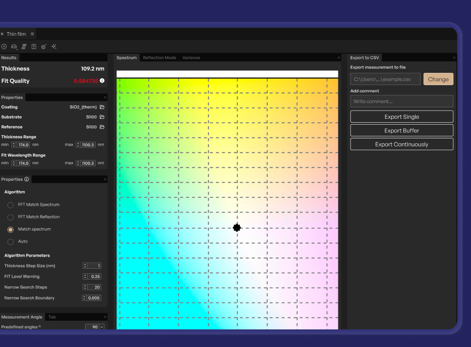
The legacy AvaSoft interface relied on traditional Windows-style form elements — dense checkbox grids, small text, and modal-heavy workflows. Our redesign replaced this with a clean, dark-themed interface that organizes the same functionality into scannable panels with clear visual hierarchy.
Design Highlights
New brand identity
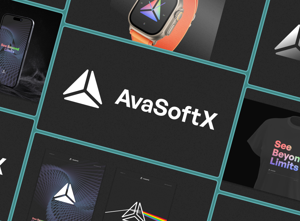
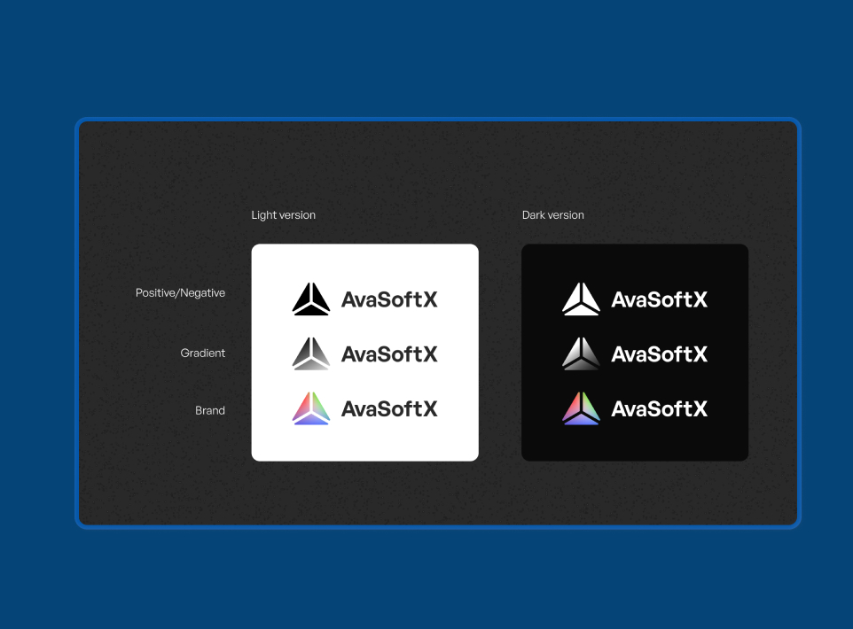
We created the AvaSoft X brand from scratch — centered around a prism logomark inspired by the iconic RGB color triangle from the legacy AvaSoft interface, reimagined as a modern symbol of spectral analysis. The identity includes positive/negative, gradient, and full-color variants optimized for both light and dark contexts, giving the software a distinct presence that matches Avantes' premium hardware.
Dark theme design system
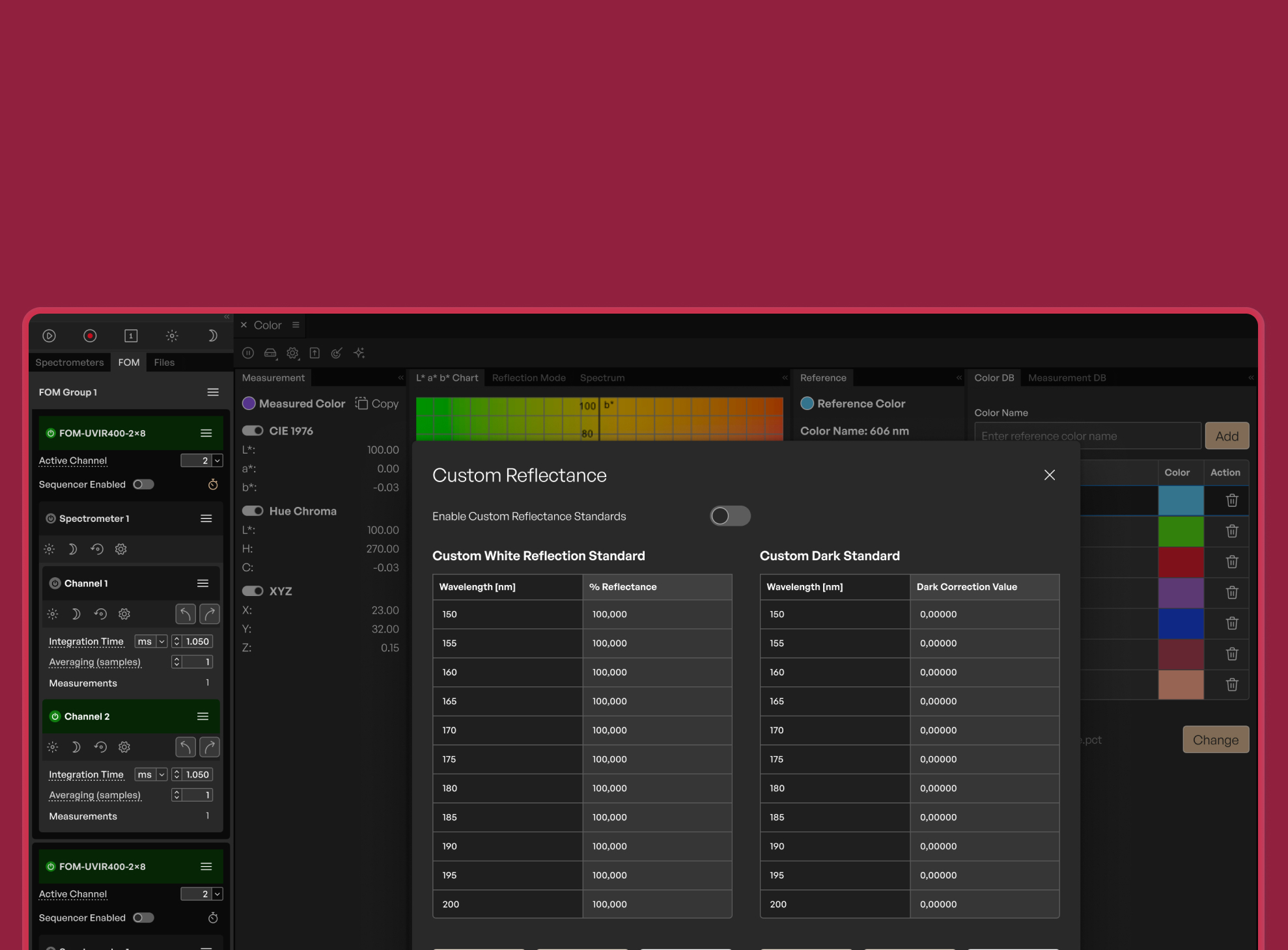
Purpose-built for lab environments and extended use, the dark theme reduces eye strain during long measurement sessions while providing optimal contrast for spectral data visualization.
Unified component library
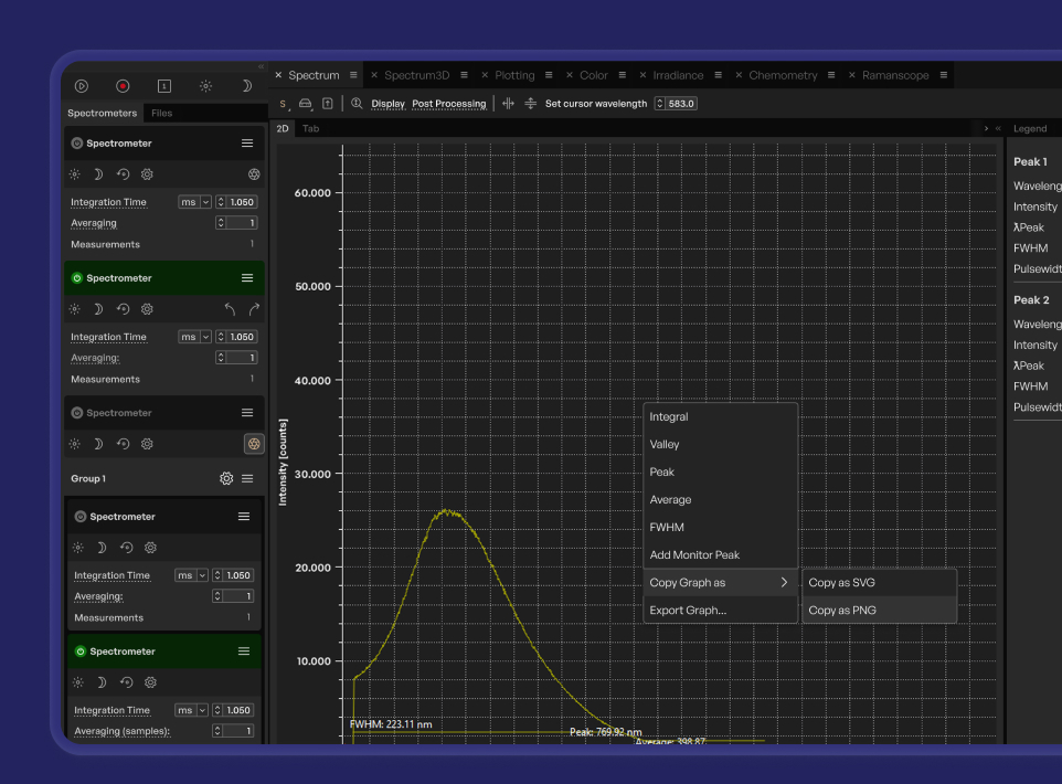
A comprehensive Figma component library — buttons, inputs, navigation elements, data pickers, toolbars — designed to ensure visual and functional consistency across all nine modules and streamline development handoff.
Redesigned data visualizations
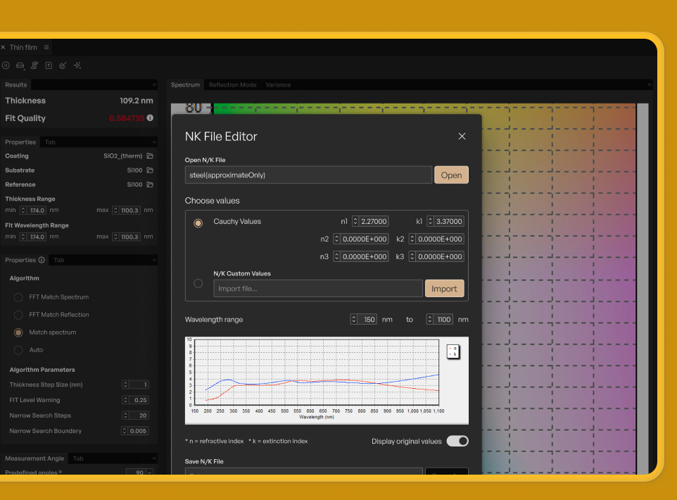
Rethought how spectral data is presented — 2D graphs, 3D surface plots, chromaticity diagrams, and periodic table overlays — each designed for clarity and optimized for the specific analysis context.
Streamlined module navigation
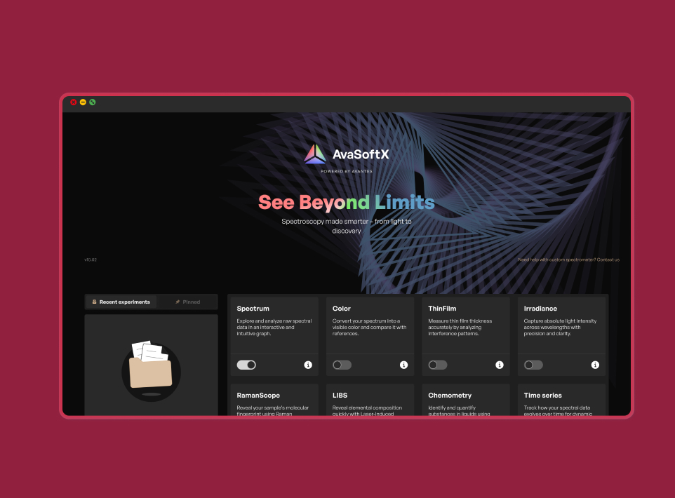
A redesigned welcome screen and unified sidebar navigation give users a clear entry point into nine specialized modules, replacing the fragmented navigation of the legacy software.
Research-driven typography
Built on General Sans Variable with a defined type scale from Caption (11px) to Display (26px), designed to maintain readability across dense data panels and extended lab sessions in a native desktop environment.
Design Process
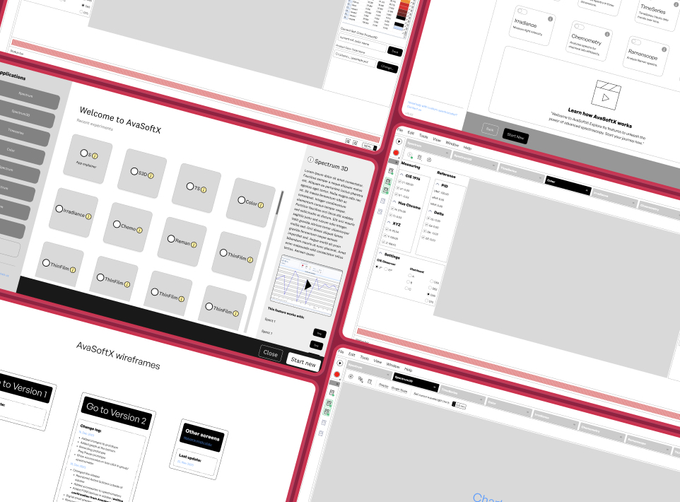
We worked through multiple rounds of wireframing to explore information architecture, module selection patterns, and navigation models. Workshop sessions with Avantes' team helped us validate assumptions from user research and iterate quickly before moving to high-fidelity designs.
Brand Identity
The AvaSoft X prism logomark draws its shape from the RGB color triangle in the legacy AvaSoft Color Selector — a familiar element for long-time users, now refined into a clean, modern mark. We delivered a complete brand system with positive/negative, gradient, and full-color variants, each optimized for light and dark contexts across the application and marketing materials.
Design System
A core deliverable was a comprehensive component library and design system built in Figma. The system defines typography scales, color tokens, spacing units, and reusable components — from buttons and inputs to complex data table patterns and toolbar configurations. This foundation enables Avantes' development team to maintain consistency as they build and extend the platform.
Plotting & Configuration
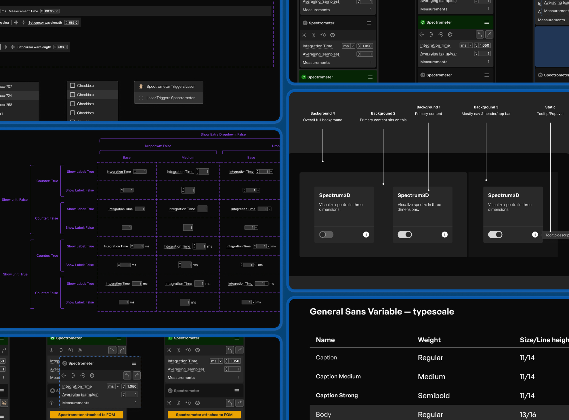
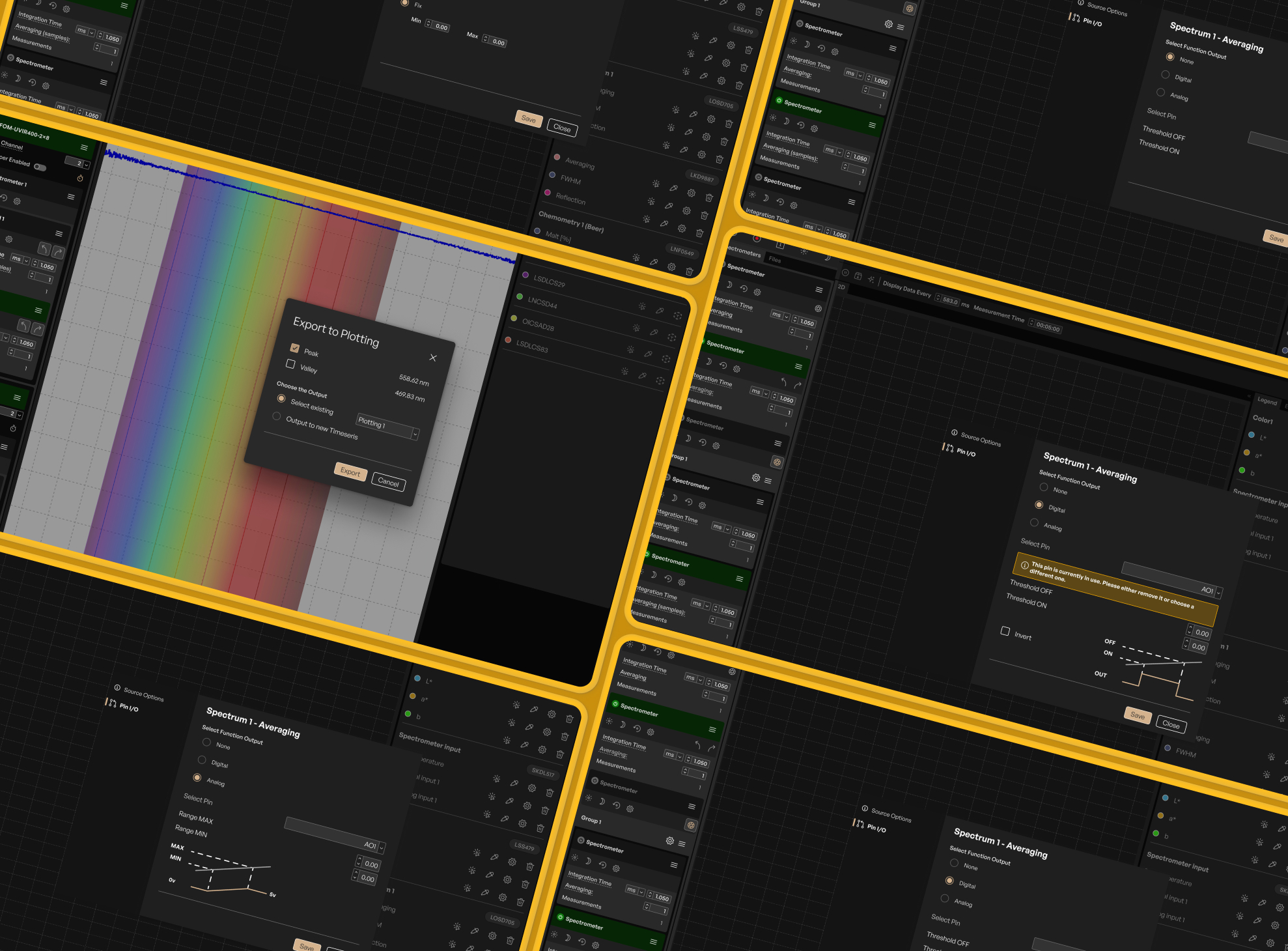
We redesigned the Plotting module's configuration experience to reduce cognitive load. Settings panels group related controls logically, surface the most-used options first, and provide visual feedback as users adjust axis ranges, overlay data series, or prepare publication-ready graphs.
Welcome Experience
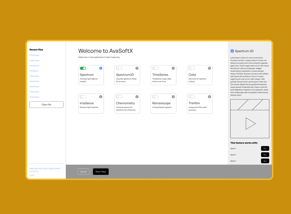
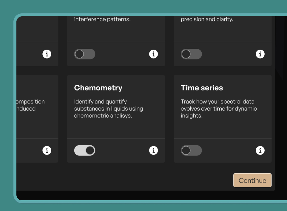
We designed the welcome screen as a launchpad built around a module selection grid — Spectrum, Spectrum3D, TimeSeries, Color, Irradiance, Chemometry, Ramanscope, and Thinfilm — each with toggle activation and an info panel showing descriptions, preview videos, and compatible spectrometer models. A recent files sidebar and "Open file" action let returning users skip straight to their data. Our research showed most users work within one or two modules, so the layout was optimized for fast, direct access.
Results and Outcomes
The redesigned AvaSoftX received strong positive feedback during user testing sessions with researchers and lab technicians, validating the new direction across all nine specialized modules.
The design system and modular UX framework ensure that as Avantes expands its product line, new measurement modules can be designed and integrated seamlessly — without starting from scratch each time.
Improved usability across experience levels
The new interface significantly improved accessibility for new users while preserving the depth that experienced scientists require. Structured navigation patterns and a consistent dark theme create a more intuitive experience without sacrificing the precision workflows power users depend on.

Unified experience across nine modules
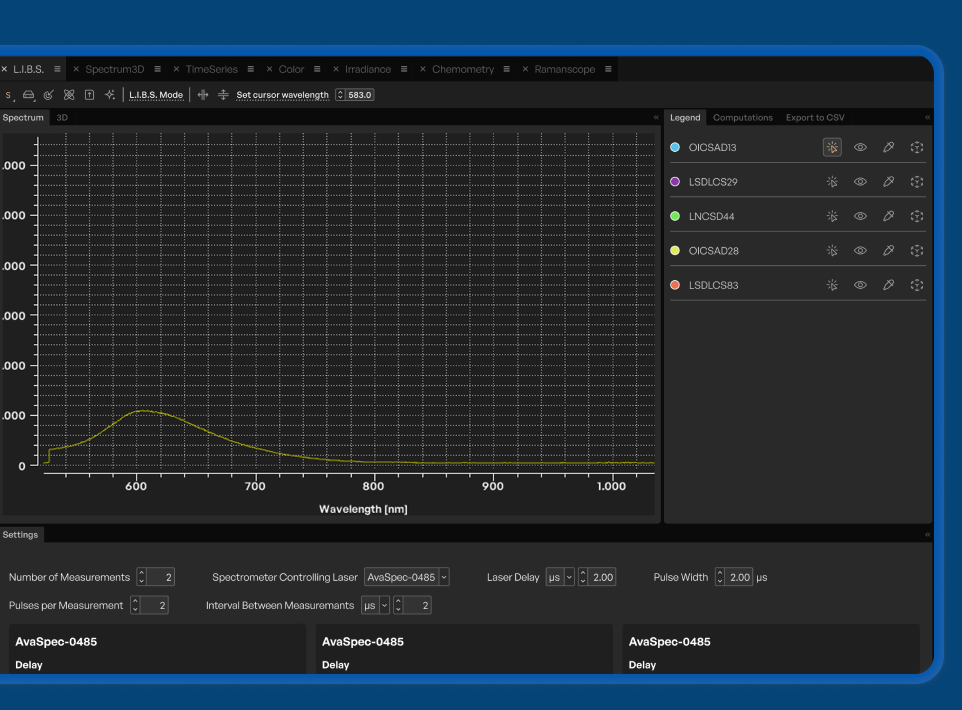
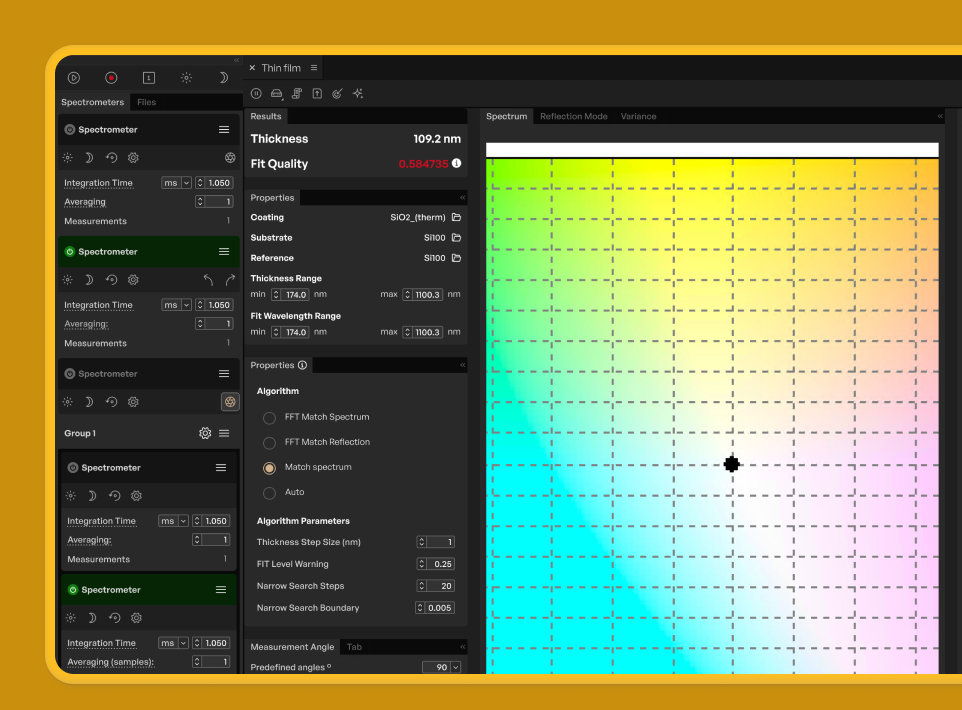
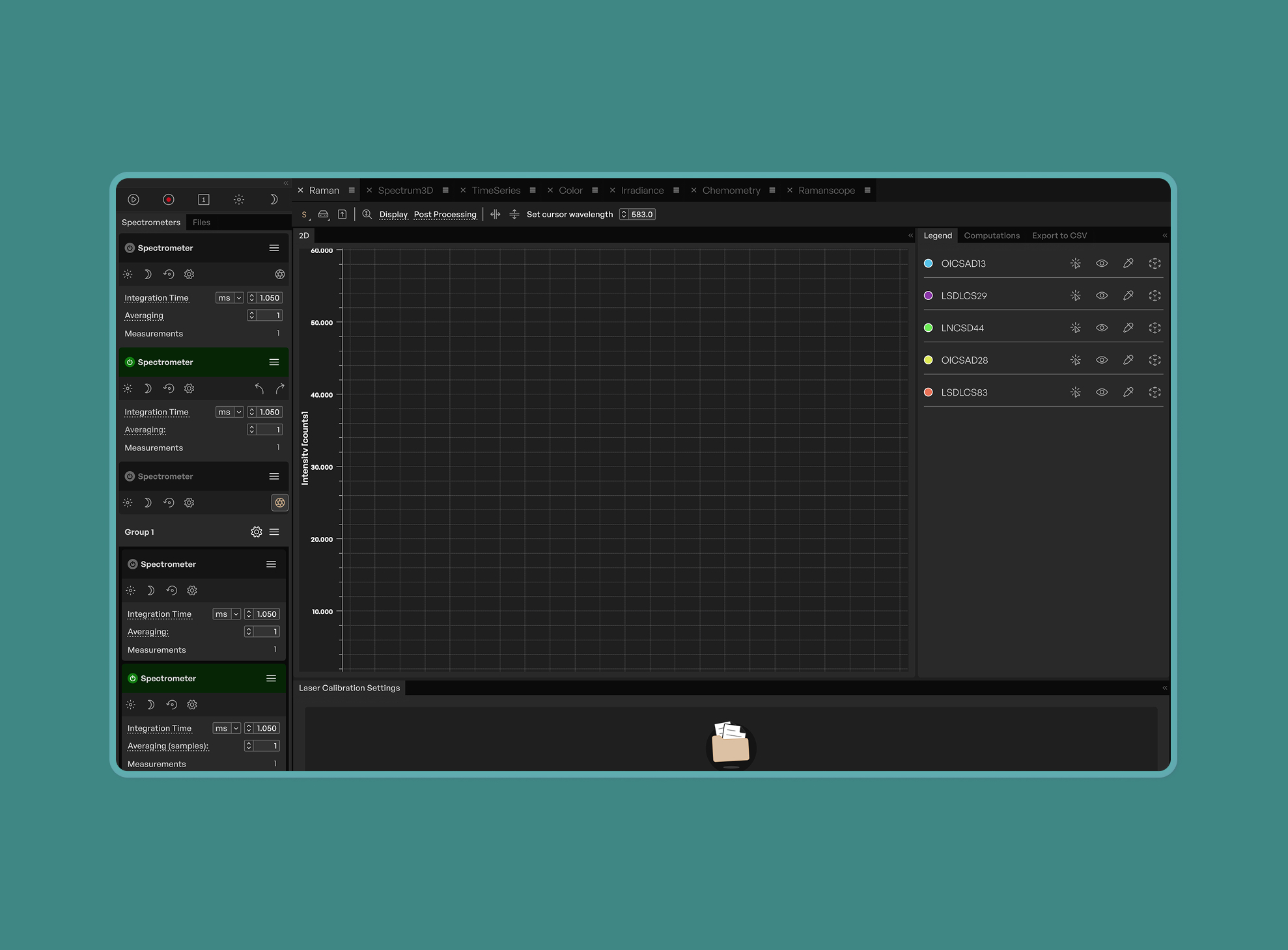
Where nine measurement modules once each followed their own navigation patterns and visual conventions, the redesign brought them under a single coherent design language. Spectrum, Color, Raman, LIBS, and every other module now share consistent interaction patterns, making it easy for researchers to move between workflows without relearning the interface.

Scalable modular framework
The modular UX architecture means each measurement module — from Spectrum and Color to Raman and LIBS — follows shared interaction patterns while accommodating its unique data requirements. As Avantes expands its product line, new modules can be designed and integrated seamlessly without starting from scratch.

Conclusion and Future Plans
The AvaSoftX redesign demonstrates how deep user research combined with systematic design thinking can transform complex scientific software. By embedding ourselves in Avantes' world — visiting labs, interviewing researchers, and working on-site with their development team — Mono delivered a design system, brand identity, and UX framework that elevates the entire product experience.
Avantes now has a scalable design foundation that ensures every new spectrometer ships with software that matches the precision of the hardware.
Need a complex desktop application redesigned for modern workflows?
Contact Mono to discover how our UX research and design expertise can transform your scientific or industrial software into a platform your users will love.